Home
About
Service
Work
Pricing
Contact Us

We create
for Businesses that want results.
We create
for Businesses that want results.
We create
for Businesses that want results.
If you can imagine it, we can create it. We offer web development and design services through subscription-based plans and packages.
If you can imagine it, we can create it. We offer web development and design services through subscription-based plans and packages.
If you can imagine it, we can create it. We offer web development and design services through subscription-based plans and packages.
See Our Service
About Us

Imagine your business as a mighty whale, ready to conquer the vast ocean of opportunities. With the right design, you’ll attract more customers and grow exponentially!
Imagine your business as a mighty whale, ready to conquer the vast ocean of opportunities. With the right design, you’ll attract more customers and grow exponentially!
Imagine your business as a mighty whale, ready to conquer the vast ocean of opportunities. With the right design, you’ll attract more customers and grow exponentially!
Whale Design Studio is a creative partner that delivers. We combine big ideas with strategic thinking to create impactful design solutions.
Whale Design Studio is a creative partner that delivers. We combine big ideas with strategic thinking to create impactful design solutions.
Whale Design Studio is a creative partner that delivers. We combine big ideas with strategic thinking to create impactful design solutions.
Projects Completed
Years Of Experience
Trusted Partners
Projects Completed
Years Of Experience
Trusted Partners
Projects Completed
Years Of Experience
Trusted Partners
Our SERVICE
Set sail toward growth with design that powers your business.
Set sail toward growth with design that powers your business.
Set sail toward growth with design that powers your business.

UX Design
Creating seamless, intuitive designs that enhance user experiences and help achieve business goals, driving customer engagement and satisfaction.
01
UX Design
Creating seamless, intuitive designs that enhance user experiences and help achieve business goals, driving customer engagement and satisfaction.
01
UX Design
Creating seamless, intuitive designs that enhance user experiences and help achieve business goals, driving customer engagement and satisfaction.
01

Branding
Crafting distinctive brand identities that resonate with your audience, build trust, and set your business apart in a competitive marketplace.
02
Branding
Crafting distinctive brand identities that resonate with your audience, build trust, and set your business apart in a competitive marketplace.
02
Branding
Crafting distinctive brand identities that resonate with your audience, build trust, and set your business apart in a competitive marketplace.
02

Social Media
Developing dynamic social media strategies that foster engagement, build community, and amplify your brand’s voice across platforms.
03
Social Media
Developing dynamic social media strategies that foster engagement, build community, and amplify your brand’s voice across platforms.
03
Social Media
Developing dynamic social media strategies that foster engagement, build community, and amplify your brand’s voice across platforms.
03
FEATURED WORKS
Efficiently managing complex projects with innovative solutions, clear communication,
and seamless execution for optimal results
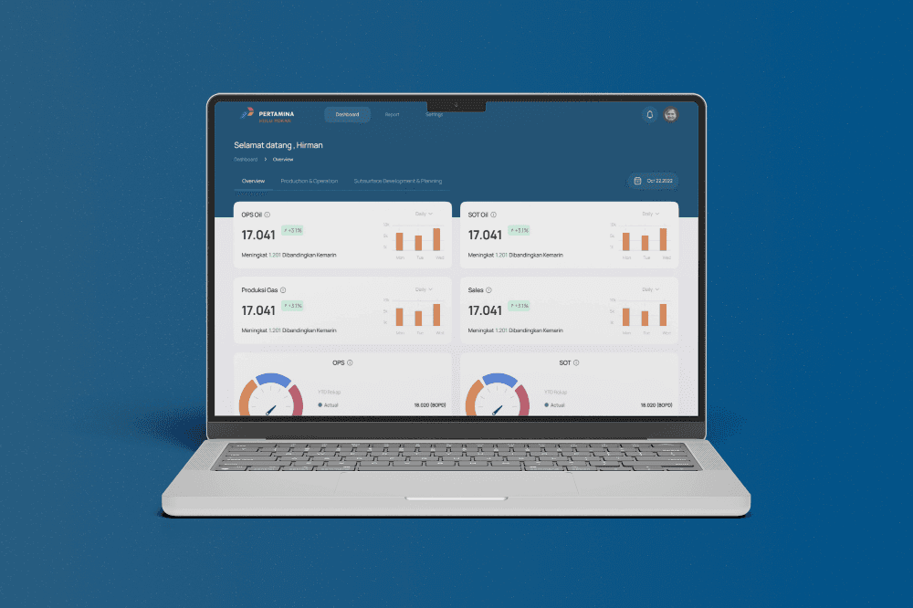
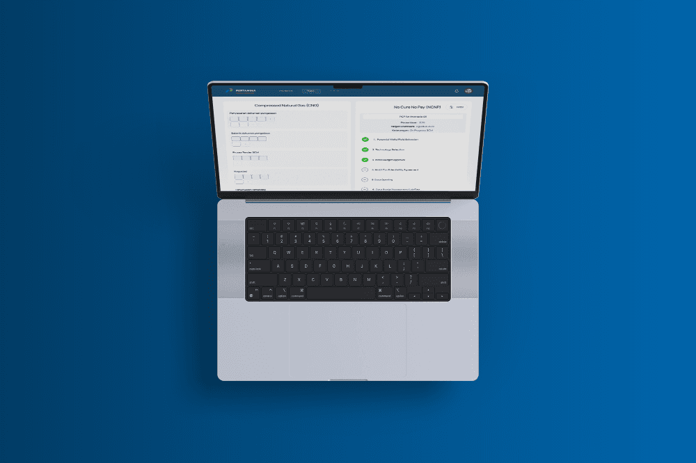
Pertamina - Digital Monitoring Dashboard

Date
2022
Service
Product Design
Product Development
About
Pertamina Hulu Rokan (PHR) Zone 1 is one of Indonesia’s key oil and gas production areas, this project is creating A digital dashboard system built for Pertamina Hulu Rokan Zone 1 to improve real time field monitoring, reduce reporting delays, and enhance operational visibility across departments.
Challenge
The primary challenge was the fragmentation of operational data across departments, leading to inefficiencies and delayed decision making. Field monitoring relied heavily on manual reporting and spreadsheets, which created inconsistencies and limited real-time visibility. Additionally, the design had to accommodate a wide range of user roles from engineers in the field to executives each with unique information needs and workflows.
Result
The solution delivered measurable improvements across several key areas:
40% reduction in report preparation time
30% adoption rate increase within the first 3 months post-launch
Real-time data integration from field to office
Role-based dashboard views for different user types
Scalable UI system ready for multi zone expansion within Pertamina

Pertamina - Digital Monitoring Dashboard
Date
2022
Service
Product Design
Product Development
About
Pertamina Hulu Rokan (PHR) Zone 1 is one of Indonesia’s key oil and gas production areas, this project is creating A digital dashboard system built for Pertamina Hulu Rokan Zone 1 to improve real time field monitoring, reduce reporting delays, and enhance operational visibility across departments.
Challenge
The primary challenge was the fragmentation of operational data across departments, leading to inefficiencies and delayed decision making. Field monitoring relied heavily on manual reporting and spreadsheets, which created inconsistencies and limited real-time visibility. Additionally, the design had to accommodate a wide range of user roles from engineers in the field to executives each with unique information needs and workflows.
Result
The solution delivered measurable improvements across several key areas:
40% reduction in report preparation time
30% adoption rate increase within the first 3 months post-launch
Real-time data integration from field to office
Role-based dashboard views for different user types
Scalable UI system ready for multi zone expansion within Pertamina
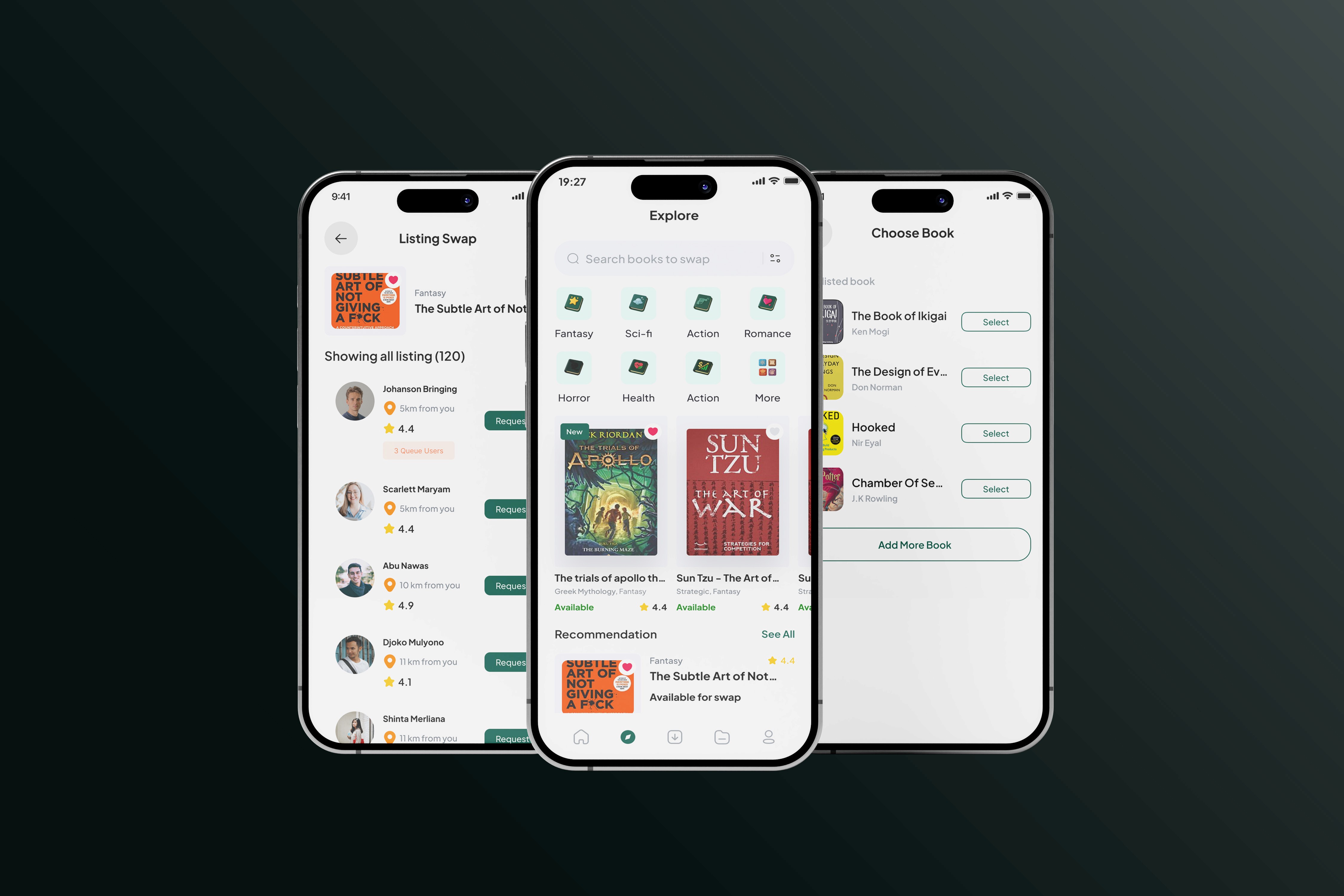
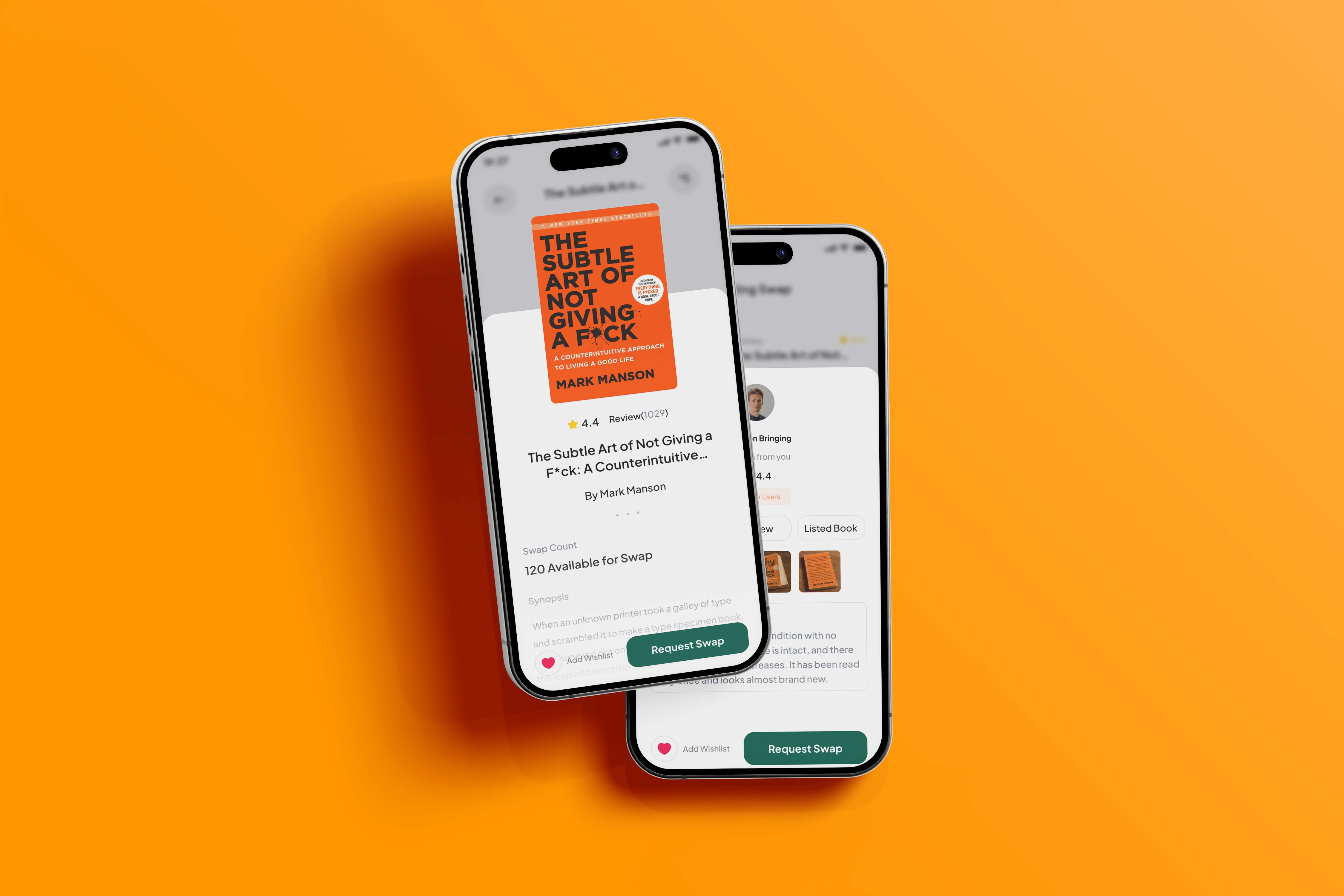
BookBridge

Date
2024
Service
Product Design
Product Development
About
The Book Bridge is a platform designed to allow users to easily swap books with others, promoting sustainability and affordability in reading. Users can list books they no longer need and browse books offered by others. Key features include the ability to list books with specific condition descriptions, manage swap requests via a queue system, and track swap progress in real-time.
Challenge
The Book Bridge App aimed to solve the problem of expensive book purchases and promote sustainable reading habits. However, we quickly encountered a few significant challenges in the design process. First, users expressed frustration with the lack of accessible books and the high costs of buying new ones. Many of them were looking for an easy way to exchange books they had already read and access new books without spending money.
Moreover, trust was a major concern. Users felt hesitant to engage in book swaps because they didn’t know what condition the books would be in when they received them. Without any clear system to indicate a book’s quality, users feared receiving damaged or poorly maintained books, which could result in disappointment and distrust within the community.
Finally, the swap process itself was complicated. Users had trouble managing multiple requests for the same book, and the app lacked clear indicators on the status of their swap requests. This left users uncertain about whether their requests were pending, accepted, or rejected, leading to frustration and confusion.
Result
In response to these challenges, we implemented several key features aimed at improving the user experience. The book condition system, where users could specify whether their book was New, Like New, Good, Acceptable, or Worn, immediately addressed concerns about book quality. This allowed users to make informed decisions before agreeing to a swap, increasing trust and making the entire process more transparent.
We also introduced a queue management system for users to see their position when multiple requests were made for the same book. This feature improved fairness by ensuring users knew whether they were next in line for a book or still waiting. To further improve the experience, we added real-time progress indicators that showed the status of the swap request, from waiting for approval to shipped and completed.
These changes had a significant impact. Engagement levels increased by 30%, as users were more likely to initiate swaps when they had a clearer understanding of where they stood in the process. The transparency of the book conditionand the progress bar helped build trust, leading to more active participation in the swap community.
Positive feedback came directly from user interviews conducted during the development phase. Many users praised the book condition transparency, expressing how important it was for them to know exactly what state the book was in before they committed to a swap.

BookBridge
Date
2024
Service
Product Design
Product Development
About
The Book Bridge is a platform designed to allow users to easily swap books with others, promoting sustainability and affordability in reading. Users can list books they no longer need and browse books offered by others. Key features include the ability to list books with specific condition descriptions, manage swap requests via a queue system, and track swap progress in real-time.
Challenge
The Book Bridge App aimed to solve the problem of expensive book purchases and promote sustainable reading habits. However, we quickly encountered a few significant challenges in the design process. First, users expressed frustration with the lack of accessible books and the high costs of buying new ones. Many of them were looking for an easy way to exchange books they had already read and access new books without spending money.
Moreover, trust was a major concern. Users felt hesitant to engage in book swaps because they didn’t know what condition the books would be in when they received them. Without any clear system to indicate a book’s quality, users feared receiving damaged or poorly maintained books, which could result in disappointment and distrust within the community.
Finally, the swap process itself was complicated. Users had trouble managing multiple requests for the same book, and the app lacked clear indicators on the status of their swap requests. This left users uncertain about whether their requests were pending, accepted, or rejected, leading to frustration and confusion.
Result
In response to these challenges, we implemented several key features aimed at improving the user experience. The book condition system, where users could specify whether their book was New, Like New, Good, Acceptable, or Worn, immediately addressed concerns about book quality. This allowed users to make informed decisions before agreeing to a swap, increasing trust and making the entire process more transparent.
We also introduced a queue management system for users to see their position when multiple requests were made for the same book. This feature improved fairness by ensuring users knew whether they were next in line for a book or still waiting. To further improve the experience, we added real-time progress indicators that showed the status of the swap request, from waiting for approval to shipped and completed.
These changes had a significant impact. Engagement levels increased by 30%, as users were more likely to initiate swaps when they had a clearer understanding of where they stood in the process. The transparency of the book conditionand the progress bar helped build trust, leading to more active participation in the swap community.
Positive feedback came directly from user interviews conducted during the development phase. Many users praised the book condition transparency, expressing how important it was for them to know exactly what state the book was in before they committed to a swap.
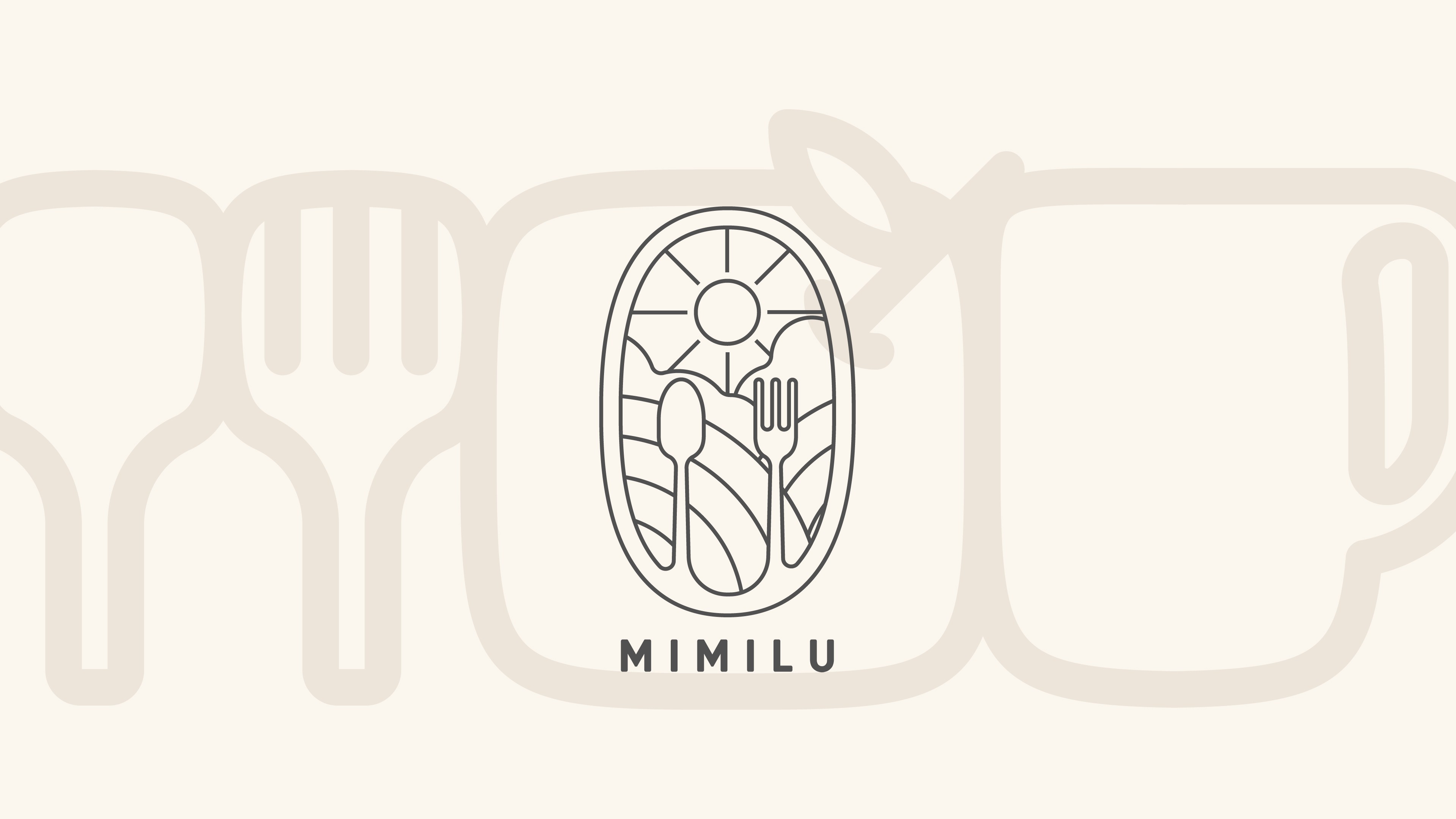
Mimilu Logo
Date
2024
Service
Visual Branding
Brand Identity
About
MIMILU started as something deeply personal. From kitchen at home, word spread, and soon MIMILU became a cozy vegetarian spot where people could eat well and feel good.
It’s more than a place to grab a meal.
Challenge
Our goal was to reflect MIMILU’s heart simple, nourishing, and honest. The design needed to feel calm but not cold, clean but still full of life.
We used soft outlines and organic forms to give the brand a sense of ease and approachability. The icons spoons, leaves, gentle curves help tell the story of a space that welcomes you in, serves you something thoughtful, and sends you off feeling a little better.
Result
In the first 3 months after the rebrand:
+18% increase in daily walk in customers
The refreshed brand identity and signage made the space more noticeable and inviting, bringing in more foot traffic from the local neighborhood.📲 +35% growth in Instagram engagement
Improved visual consistency and storytelling encouraged more customer interactions—likes, shares, and tagged posts.
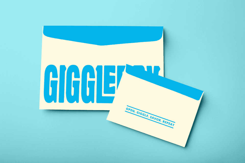
GiggleBox Collateral

Date
2024
Service
Visual Branding
Collateral
About
Born in Bandung, Giggle Box has become a household name for casual dining that doesn’t take itself too seriously. With its cozy spaces, quirky personality, and comfort food favorites, the brand offers more than just a meal it delivers an experience that feels light, fun, and familiar.
Our task was to capture that spirit and turn it into a design system that works across every touchpoint from menus and packaging to digital presence while keeping the charm that people love about Giggle Box.
Challenge
Giggle Box had a strong foundation a beloved name, a loyal customer base, and a cheerful vibe. But as the brand expanded, its visual identity didn’t fully translate across the growing number of collateral needs.
The challenge wasn’t just to redesign it was to create a system.
We needed to build a visual language that could stretch across every touchpoint:
from print to digital, dine-in to delivery while staying true to the brand’s fun, friendly spirit.
We started by defining what “fun” means for Giggle Box in today’s context—playful but not childish, bold but not overwhelming. From there, we built a modular design system that could adapt across different collateral without losing its personality.
Typography was chosen to feel round and friendly, with just enough character to stand out without shouting.
Illustration style was simplified and expressive great for social media, menus, and even wall graphics.
Layout systems were created to make every piece from combo cards to promotional banners instantly recognizable.
Result
The refreshed branding helped Giggle Box strengthen its identity and reconnect with a younger, digitally savvy audience.
+39% increase in social media engagement
Eye catching design elements made it easier for customers to share their experience online.+17% growth in takeaway & delivery orders
Improved packaging design and brand presentation helped build trust and familiarity outside the restaurant.Improved customer recall and brand affinity
A consistent visual language across outlets made the brand more memorable whether customers dined in Bandung or beyond.


GiggleBox Collateral
Date
2024
Service
Visual Branding
Collateral
About
Born in Bandung, Giggle Box has become a household name for casual dining that doesn’t take itself too seriously. With its cozy spaces, quirky personality, and comfort food favorites, the brand offers more than just a meal it delivers an experience that feels light, fun, and familiar.
Our task was to capture that spirit and turn it into a design system that works across every touchpoint from menus and packaging to digital presence while keeping the charm that people love about Giggle Box.
Challenge
Giggle Box had a strong foundation a beloved name, a loyal customer base, and a cheerful vibe. But as the brand expanded, its visual identity didn’t fully translate across the growing number of collateral needs.
The challenge wasn’t just to redesign it was to create a system.
We needed to build a visual language that could stretch across every touchpoint:
from print to digital, dine-in to delivery while staying true to the brand’s fun, friendly spirit.
We started by defining what “fun” means for Giggle Box in today’s context—playful but not childish, bold but not overwhelming. From there, we built a modular design system that could adapt across different collateral without losing its personality.
Typography was chosen to feel round and friendly, with just enough character to stand out without shouting.
Illustration style was simplified and expressive great for social media, menus, and even wall graphics.
Layout systems were created to make every piece from combo cards to promotional banners instantly recognizable.
Result
The refreshed branding helped Giggle Box strengthen its identity and reconnect with a younger, digitally savvy audience.
+39% increase in social media engagement
Eye catching design elements made it easier for customers to share their experience online.+17% growth in takeaway & delivery orders
Improved packaging design and brand presentation helped build trust and familiarity outside the restaurant.Improved customer recall and brand affinity
A consistent visual language across outlets made the brand more memorable whether customers dined in Bandung or beyond.
Luumi

Date
2024
Service
Digital Marketing
Social Media
About
Luumi is a modern household brand from Indonesia, known for its 3-in-1 detergent capsules designed to simplify everyday chores. With a focus on efficiency, skin safety, and long lasting freshness, Luumi turns the hassle of laundry into a clean, uplifting routine.
Their playful tone “Jangan Gloomy, Ada Luumi!” reflects a bigger mission to bring ease, joy, and smart solutions into every Indonesian home.
Challenge
Luumi had a great product and a fun tagline but their social media presence didn’t yet reflect the brand’s full potential.
The challenge was to translate Luumi’s bright, functional personality into content that’s scroll-stopping, informative, and relatable, especially for a target market that includes young moms, first jobbers, and health conscious homemakers.
We approached social media not just as a marketing channel, but as Luumi’s main stage.
Our strategy focused on three key pillars:
Playful product moments – building brand personality through memes, motion, and everyday humor
Clean, modular layouts ensuring every post looks fresh, consistent, and on-brand
The goal? Make every scroll feel like a small reminder that Luumi makes life easier.
Result
Impact (in 1 month)
+13% increase in engagement rate
(from average 2.4% to 2.7%)+760 new followers, organic & boosted posts combined
Clearer brand identity on social media, setting the tone for future content growth
Though short, the collaboration helped set the visual and messaging tone that Luumi could confidently build on.


Luumi
Date
2024
Service
Digital Marketing
Social Media
About
Luumi is a modern household brand from Indonesia, known for its 3-in-1 detergent capsules designed to simplify everyday chores. With a focus on efficiency, skin safety, and long lasting freshness, Luumi turns the hassle of laundry into a clean, uplifting routine.
Their playful tone “Jangan Gloomy, Ada Luumi!” reflects a bigger mission to bring ease, joy, and smart solutions into every Indonesian home.
Challenge
Luumi had a great product and a fun tagline but their social media presence didn’t yet reflect the brand’s full potential.
The challenge was to translate Luumi’s bright, functional personality into content that’s scroll-stopping, informative, and relatable, especially for a target market that includes young moms, first jobbers, and health conscious homemakers.
We approached social media not just as a marketing channel, but as Luumi’s main stage.
Our strategy focused on three key pillars:
Playful product moments – building brand personality through memes, motion, and everyday humor
Clean, modular layouts ensuring every post looks fresh, consistent, and on-brand
The goal? Make every scroll feel like a small reminder that Luumi makes life easier.
Result
Impact (in 1 month)
+13% increase in engagement rate
(from average 2.4% to 2.7%)+760 new followers, organic & boosted posts combined
Clearer brand identity on social media, setting the tone for future content growth
Though short, the collaboration helped set the visual and messaging tone that Luumi could confidently build on.
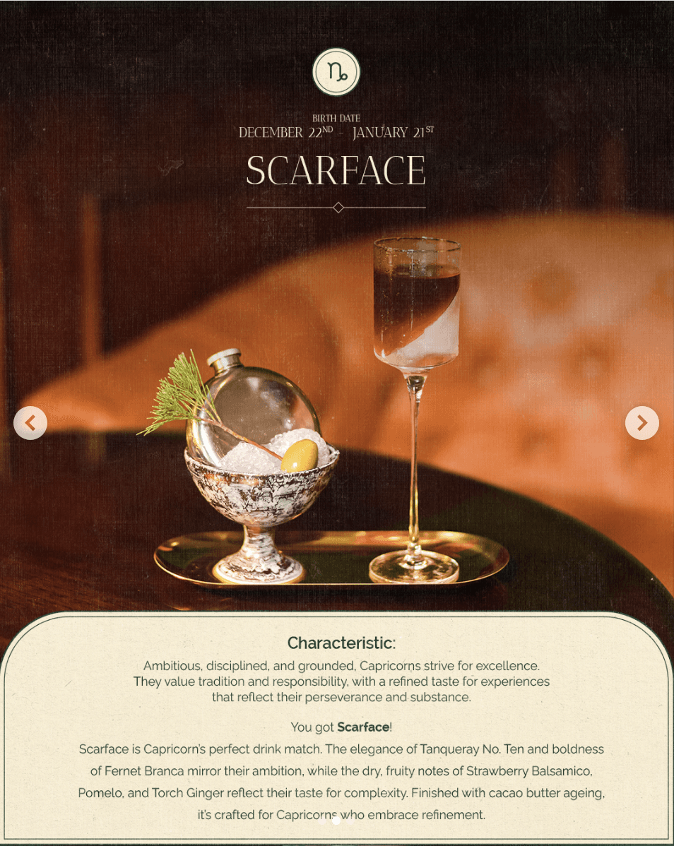
Aperitif Social Media

Date
2024
Service
Digital Marketing
Social Media
About
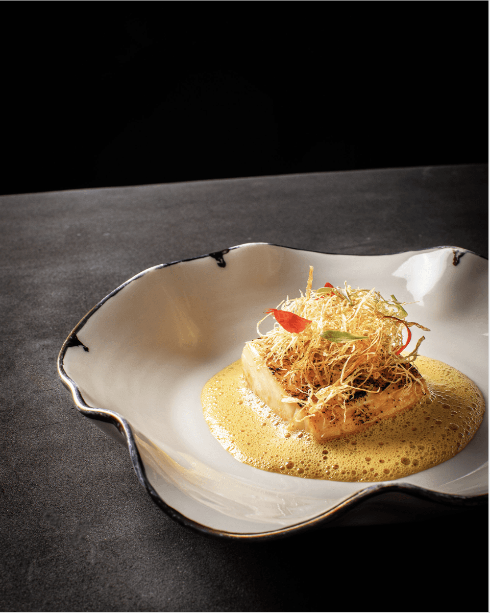
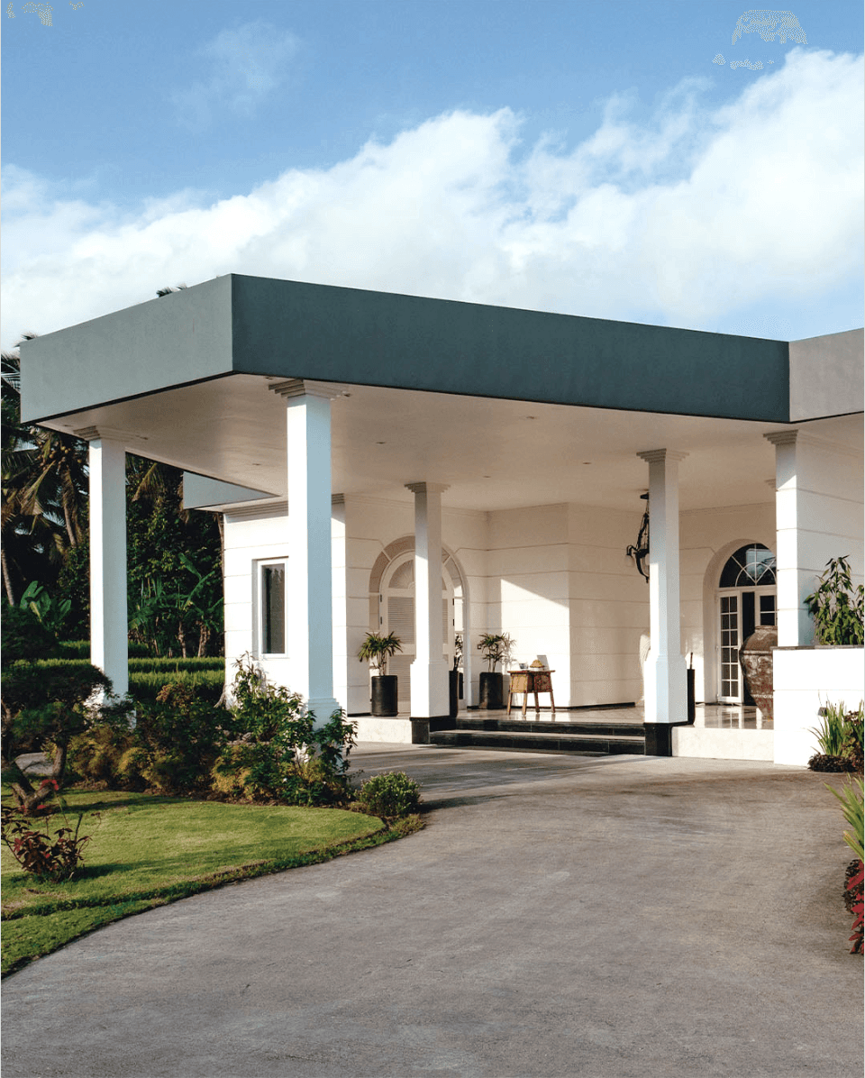
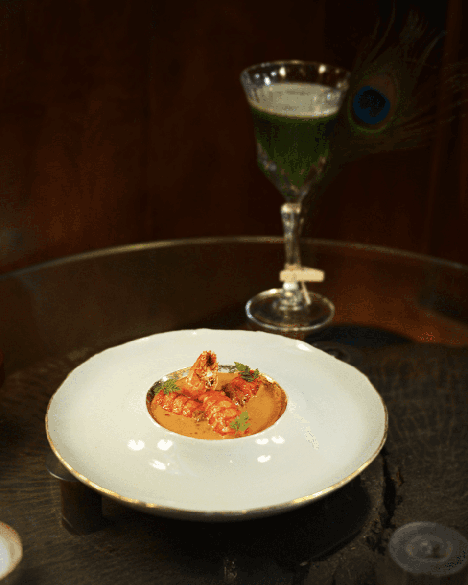
Nestled in the heart of Ubud, Bali Apéritif is more than a fine dining restaurant it’s a full-sensory journey through time, taste, and elegance. With a menu that fuses European techniques and Asian influences, and a space that echoes 1920s colonial charm, Apéritif invites guests into an experience that is immersive, indulgent, and unforgettable.
Challenge
Apéritif had already made a name for itself in Bali’s fine dining scene. But the challenge was to translate that multi-sensory, luxurious experience into digital storytelling especially on social media, where attention spans are short and competition is steep.
Our task was to craft a visual and content direction that reflects elevated luxury, while still feeling inviting and current to international travelers and culinary enthusiasts.
We built a social media presence that mirrors the restaurant’s signature qualities: refined, theatrical, and full of subtle detail.
Developed a visual language inspired by old-world elegance, with rich tones, cinematic lighting, and curated typography
Created modular layouts for menus, reviews, and chef stories balancing consistency with visual drama
Used story driven captions to elevate simple posts into narrative moments: the making of a dish, a glance into the kitchen, a guest’s special night
Integrated motion & video to showcase chef artistry, plating precision, and atmospheric interiors
The result was a feed that didn’t just show food it invited followers into the story of the experience.
Result
Through ongoing social media collaboration with Apéritif, we’ve helped transform their Instagram into a true extension of the fine dining experience refined, immersive, and story driven.
672.8K Views in November, a 59% jump from October, indicating strong visual traction.
Link Clicks doubled in November, showing improved user interest and CTA performance.
Content Interactions peaked at 8.7K in November — +314% vs September, driven by engaging visual campaigns.
Follower growth remained strong, with an average of 470+ new followers per month despite seasonal fluctuations.

Aperitif Social Media
Date
2024
Service
Digital Marketing
Social Media
About
Nestled in the heart of Ubud, Bali Apéritif is more than a fine dining restaurant it’s a full-sensory journey through time, taste, and elegance. With a menu that fuses European techniques and Asian influences, and a space that echoes 1920s colonial charm, Apéritif invites guests into an experience that is immersive, indulgent, and unforgettable.
Challenge
Apéritif had already made a name for itself in Bali’s fine dining scene. But the challenge was to translate that multi-sensory, luxurious experience into digital storytelling especially on social media, where attention spans are short and competition is steep.
Our task was to craft a visual and content direction that reflects elevated luxury, while still feeling inviting and current to international travelers and culinary enthusiasts.
We built a social media presence that mirrors the restaurant’s signature qualities: refined, theatrical, and full of subtle detail.
Developed a visual language inspired by old-world elegance, with rich tones, cinematic lighting, and curated typography
Created modular layouts for menus, reviews, and chef stories balancing consistency with visual drama
Used story driven captions to elevate simple posts into narrative moments: the making of a dish, a glance into the kitchen, a guest’s special night
Integrated motion & video to showcase chef artistry, plating precision, and atmospheric interiors
The result was a feed that didn’t just show food it invited followers into the story of the experience.
Result
Through ongoing social media collaboration with Apéritif, we’ve helped transform their Instagram into a true extension of the fine dining experience refined, immersive, and story driven.
672.8K Views in November, a 59% jump from October, indicating strong visual traction.
Link Clicks doubled in November, showing improved user interest and CTA performance.
Content Interactions peaked at 8.7K in November — +314% vs September, driven by engaging visual campaigns.
Follower growth remained strong, with an average of 470+ new followers per month despite seasonal fluctuations.
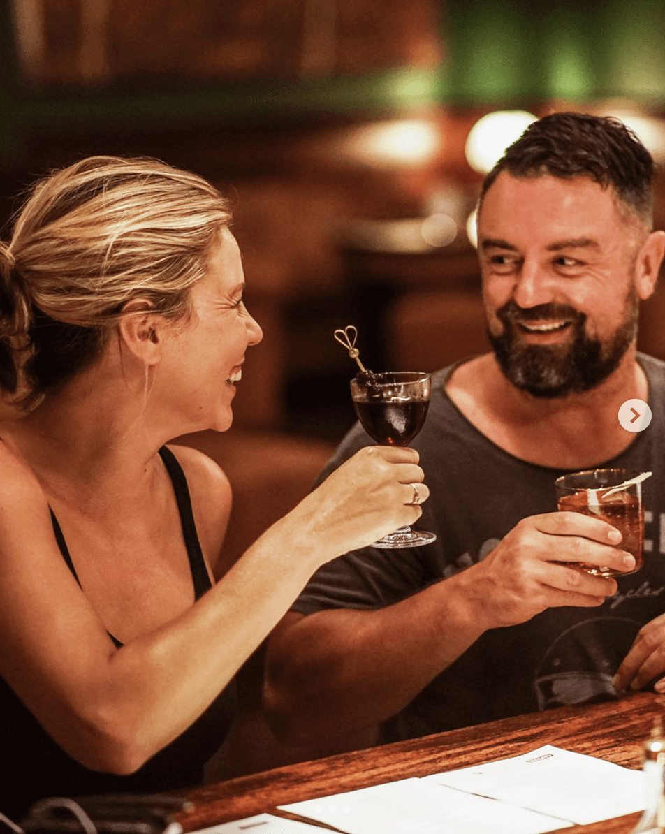
Pinstripe Social Media

Date
2024
Service
Digital Marketing
Social Media
About
Pinstripe is a cocktail bar nestled beside Apéritif Restaurant, offering a more intimate yet equally elevated experience. With interiors that echo 1920s charm and a drinks menu rooted in craft, Pinstripe blends old world elegance with modern edge serving carefully curated cocktails in an atmosphere that feels both cinematic and personal.
Challenge
Pinstripe had all the right elements stunning interiors, inventive drinks, and a loyal in-house audience. But its online presence didn’t quite capture that same energy.
Our challenge was to turn a physically atmospheric space into a visually magnetic feed building a digital brand that’s bold, moody, and unmistakably Pinstripe.
Targeted Content Planning: Introduced themed content aligned with the bar’s identity (e.g., craft cocktails, ambiance, and events).
Posting Schedule Optimization: Identified high engagement days through analytics and scheduled posts accordingly.
Interactive Elements: Used Stories, Polls, and Reels to foster audience interaction and retention.
Link-in-Bio Strategy: Boosted link clicks by optimizing CTA placements and captions for menu, bookings, and promos.
Built a deep-toned visual palette with accents of brass and woodgrain to reflect the bar’s interiors
Developed a system of photo and video storytelling, combining ambiance shots, mixologist close-ups, and menu highlights
Paired short-form copywriting with sensory language, giving every post a flavor and texture
Result
Through consistent, story rich content, Pinstripe’s digital presence now mirrors its physical experience sophisticated, warm, and highly curated.
273.4K Views in November 2024 , a 61.6% increase from October 2024.
275.8% spike in Link Clicks within one month — indicating strong interest in promos and menus.
Organic Follower Growth: 373 new followers over 3 months (September - November) (Avg. +120/month).
Improved Engagement Rate: Sustained rise in content interactions (+58.9% in November 2024) through creative visuals and relatable copywriting.
Pinstripe Social Media
Date
2024
Service
Digital Marketing
Social Media
About
Pinstripe is a cocktail bar nestled beside Apéritif Restaurant, offering a more intimate yet equally elevated experience. With interiors that echo 1920s charm and a drinks menu rooted in craft, Pinstripe blends old world elegance with modern edge serving carefully curated cocktails in an atmosphere that feels both cinematic and personal.
Challenge
Pinstripe had all the right elements stunning interiors, inventive drinks, and a loyal in-house audience. But its online presence didn’t quite capture that same energy.
Our challenge was to turn a physically atmospheric space into a visually magnetic feed building a digital brand that’s bold, moody, and unmistakably Pinstripe.
Targeted Content Planning: Introduced themed content aligned with the bar’s identity (e.g., craft cocktails, ambiance, and events).
Posting Schedule Optimization: Identified high engagement days through analytics and scheduled posts accordingly.
Interactive Elements: Used Stories, Polls, and Reels to foster audience interaction and retention.
Link-in-Bio Strategy: Boosted link clicks by optimizing CTA placements and captions for menu, bookings, and promos.
Built a deep-toned visual palette with accents of brass and woodgrain to reflect the bar’s interiors
Developed a system of photo and video storytelling, combining ambiance shots, mixologist close-ups, and menu highlights
Paired short-form copywriting with sensory language, giving every post a flavor and texture
Result
Through consistent, story rich content, Pinstripe’s digital presence now mirrors its physical experience sophisticated, warm, and highly curated.
273.4K Views in November 2024 , a 61.6% increase from October 2024.
275.8% spike in Link Clicks within one month — indicating strong interest in promos and menus.
Organic Follower Growth: 373 new followers over 3 months (September - November) (Avg. +120/month).
Improved Engagement Rate: Sustained rise in content interactions (+58.9% in November 2024) through creative visuals and relatable copywriting.
Trusted by


Ready to make a Wave
Let’s talk about how Whale Design can help!
Contact Us
Ready to make a Wave
Let’s talk about how Whale Design can help!
Contact Us
Ready to make a Wave
Let’s talk about how Whale Design can help!
Contact Us
What They Say
“
Collaborating with Whale Studio was a seamless experience. Their product design team truly understood our industry needs and translated them into a user-centric solution. We've seen improved workflow across our digital platforms since launch.

Fahmi Nugraha
Analyst at Pertamina Hulu Rokan
“
Their design wasn’t just beautiful it worked. Whale Studio helped us identify friction points that were costing us conversions. After launching the new design, our product saw a 2x lift in form submissions and an increase in internal team productivity.

Trisnayudha Bachtiar
IT Officer at Indonesia
Miner
“
Whale Studio brought clarity and structure to our complex internal system. Their product design not only improved the interface but helped streamline our workflow, making it easier for different stakeholders to access, act on. The impact was immediate.

Rifqi
Gis Analyst at Kementerian Kehutanan Republik Indonesia
FAQ
What services does Whale Design Studio offer?
What services does Whale Design Studio offer?
What services does Whale Design Studio offer?
How does the subscription model work?
How does the subscription model work?
How does the subscription model work?
Can I request a one time project without a subscription?
Can I request a one time project without a subscription?
Can I request a one time project without a subscription?
How long does a typical project take?
How long does a typical project take?
How long does a typical project take?
How long does a typical project take?
How long does a typical project take?
How long does a typical project take?

Dribbble
Behance
Tiktok